Harry’s Starter Set
Context: The Shave Trial Set was Harry’s discounted starter kit for new customers. Purchasing it automatically enrolled users into a monthly subscription.
The Problem: User surveys revealed confusion about what the set included (e.g., how many razors were in it), leading to post-trial drop-off.
Our Solution: Refreshed Trial Set imagery and copy to clearly communicate the full assortment and key features, tying callouts directly to user-valued details. Clarified subscription terms and provided an opt-out option.
The Process: Analyzed survey data and NPS scores to pinpoint pain points: +42.2% abandonment at Starter Set cart checkout and NPS score fell between about +20 and +30
1. Highlighted features users valued most (weighted handle, blade count, shave gel).
2. Tested updated copy and imagery with a small user group, iterated on feedback.
My Role:
Wrote all page copy and product microcopy
Assisted in running user surveys and analyzing feedback
Ideated content solutions based on findings
The Team:
UX Writer/Content Designer: Audrey Siaw-Asamoah
UX Designer: Monica Han
Strategy & Ops: Colin Sullivan
Lead UX/UI: Federico de Sanctis
Engineering
Impact:
Reduced churn from the Starter Set by 40%
Boosted subscription retention
Established clearer naming conventions across the site
Busy descriptor bullet points with hard-to-see icons
Gallery flow did not clarify users received one razor handle with refills
Gallery flow could include more product details to clarify what set includes
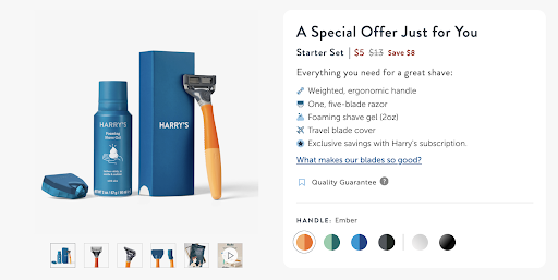
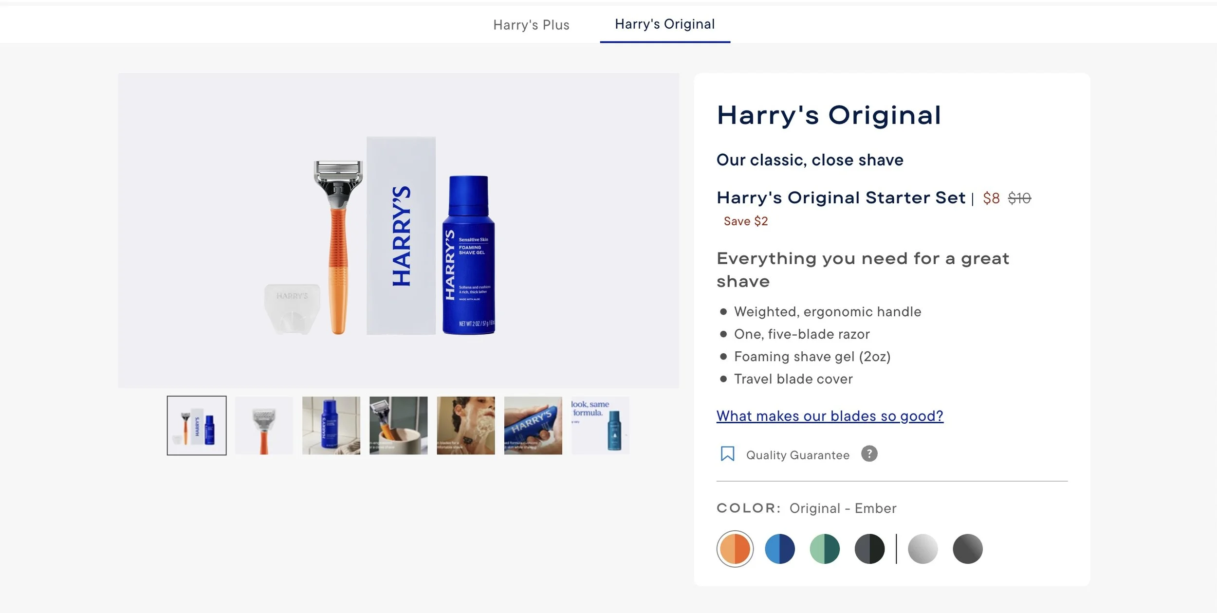
PDP Before
Testing Results
We conducted user testing on our first version. Overall, they were confused by four things:
What we called this set. I conducted an informal content audit and found our site referred to this set as both a Trial Set and a Starter Set interchangeably
The icons in our description bullets
The image microcopy (too small, looked clunky to them)
How ordering one Trial Set automatically enrolled them in a monthly subscription - this needs to be clarified or removed
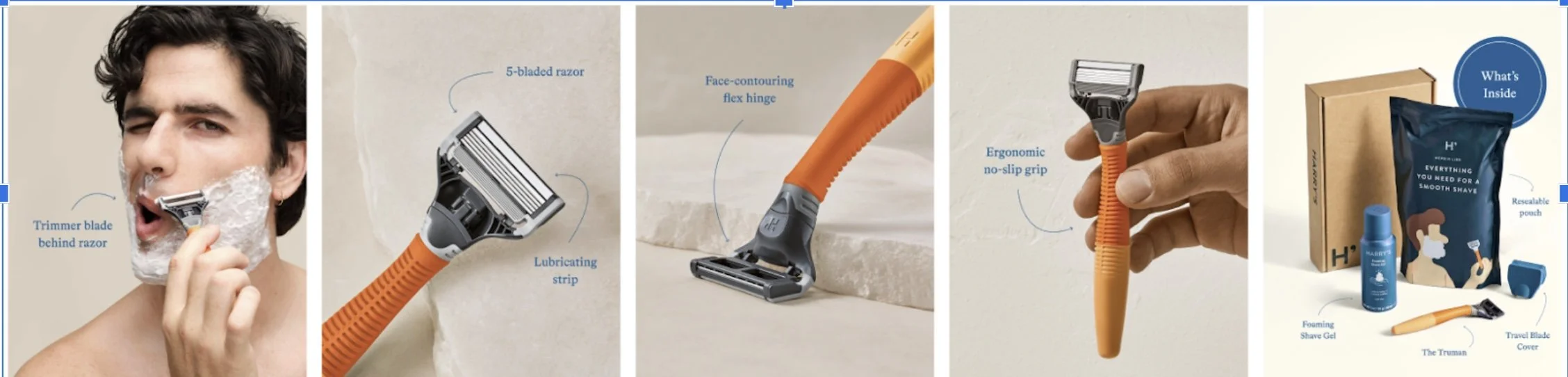
Gallery Flow 1
This was a suggestion my designer and I brought to the team that included microcopy with guiding product details as users’ hovered over images in the gallery flow.
Updated Flow
Step 1 of flow, updated homepage
Highlight set in red to clarify start of journey to users
Conducted content audit on name: saw both Trial Set and Starter Set used synonymously on site
Compromised with Marketing and brand on naming convention —> Starter Set on PDP, Shave Trial on homepage to capture new users
My designer removed the icons to streamline the description section visually
I simplified image microcopy and kept one product shot per photo except the first
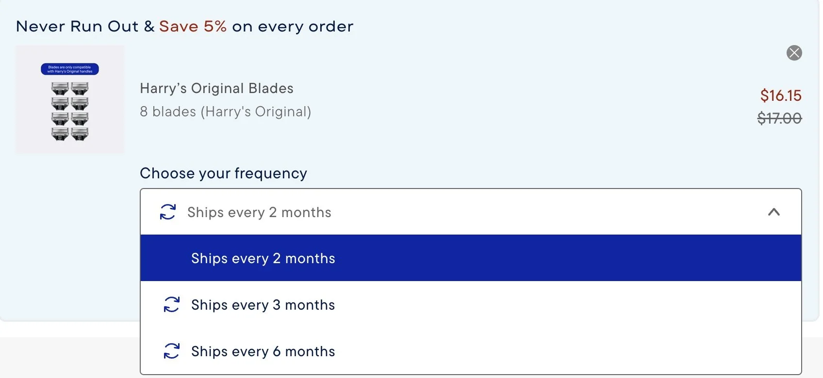
Step 2, PDP
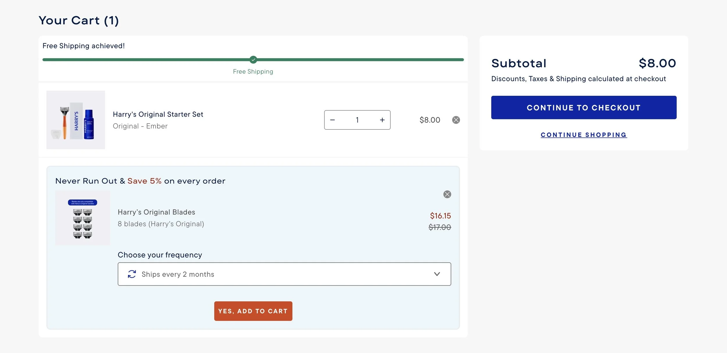
I added in clear opt-in subscription language prior to checkout
Also communicated value of subscribing so the suggestion is helpful to users and drives business goals (i.e. ‘Never Run Out & Save 5% on every order’)
Added in dropdown for frequency to allow for greater user customization
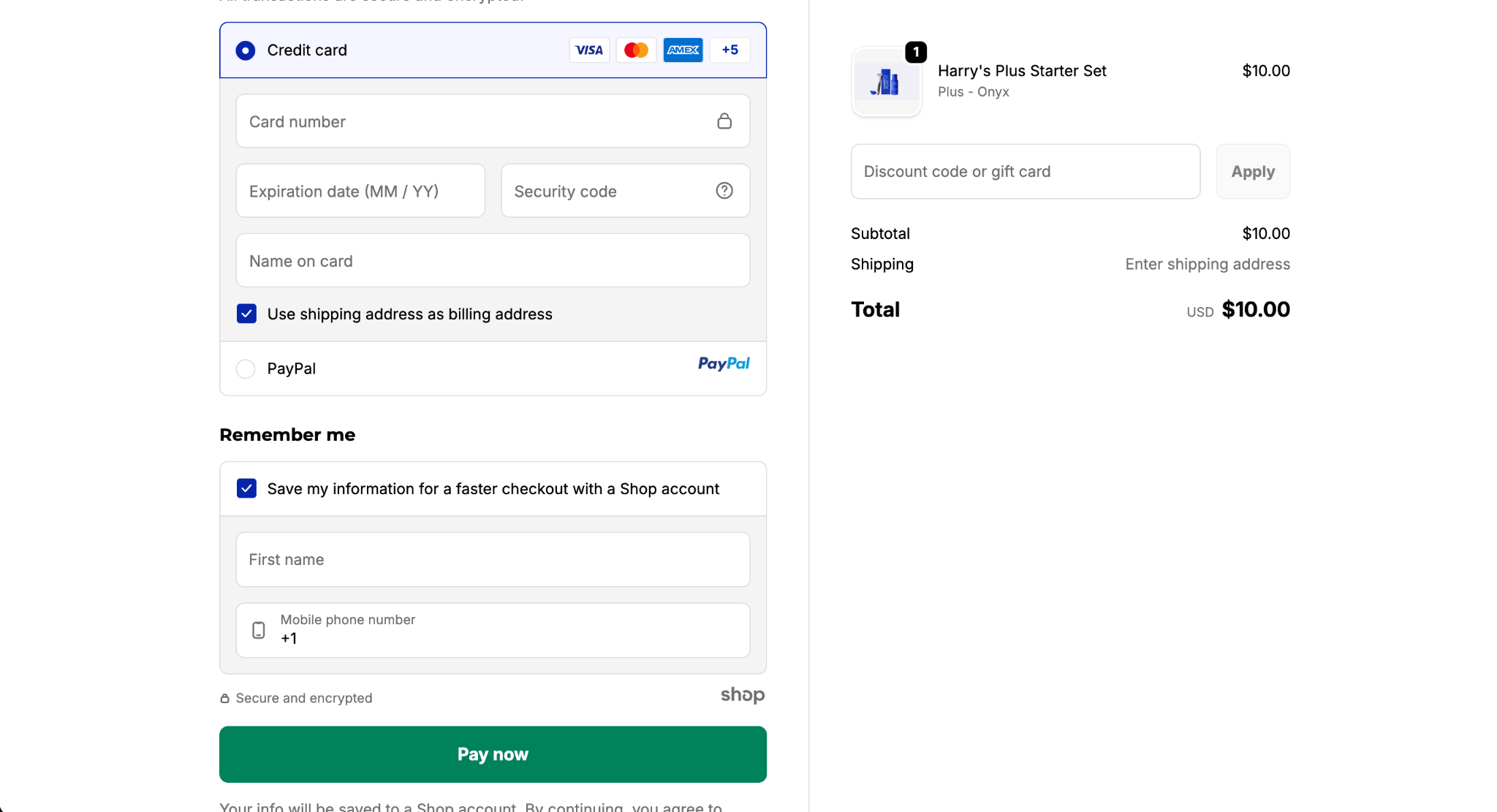
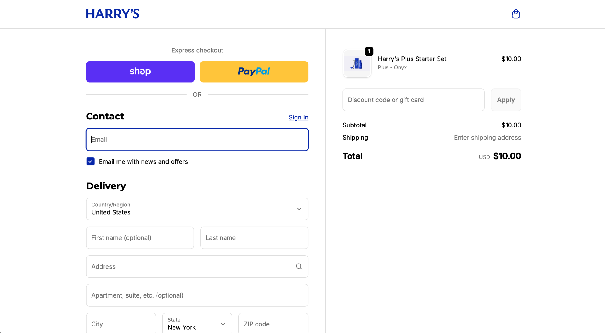
Step 3, Checkout
Added in shopify and paypal pay options to extend ways of paying for user
Impact
Checkout Conversion Rate (CVR) ↑ +243 bps (+4.8%) week-over-week → more users successfully moved through checkout.
Purchase Conversion Rate (CVR) ↑ +465 bps (+21.8%) → significantly more users completed their purchase after the update.
Established clearer naming conventions across the site
Gathered actionable user data for our Harry’s Plus vs. Harry’s Original subscription flow
Before - Starter Set is orange, Subscribers are Pink

After - Starter Set is orange